In June Google started to roll out a new design for their video platform Youtube. I wrote about it here. It is very similar to the latest redesign of Google+.
Today I recognised some more changes. They’re not that big but I would say it’s enough to talk about.
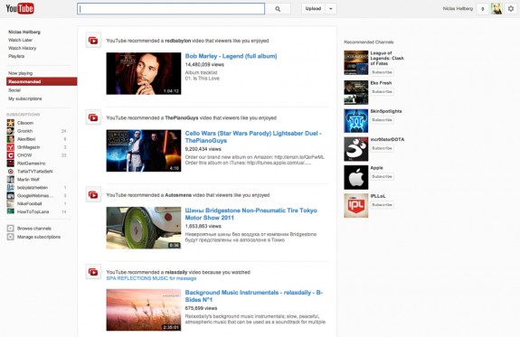
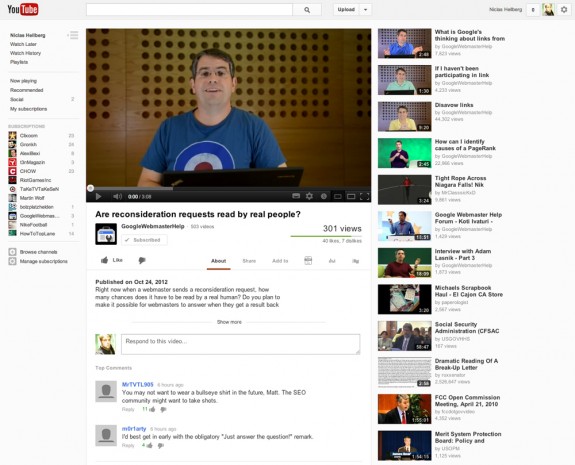
So, what’s new? Besides the new look of the left sidebar the entire site (including video detail pages) is left-justified now. I would love to know the reason behind this decision. Furthermore, the left sidebar which is showing subscriptions and activities will be present on every page now. Those two changes will mostly affect the presentation of videos.
I think not everybody is seeing all the changes yet. So, here are two screenshots of the new design:
Youtube’s new activity stream.
The detail page which is presenting the videos.
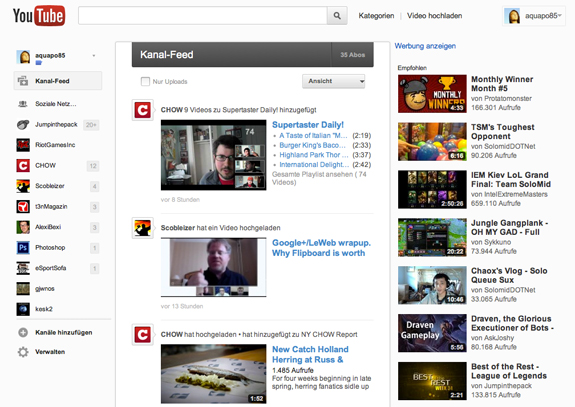
And a screenshot of the old design:

The design which was presented in June this year.


