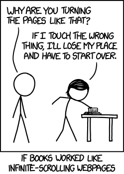
Don’t get me wrong, I don’t question the infinite scrolling technique in general. The problem is, in most cases the implementation of the alternative to paginations is really bad. So bad that I left websites (with excellent content) several times because of a terrible scrolling experience.
What’s wrong about Infinite Scrolling?
- Performance issues: A website that uses Infinite Scrolling gobbles up a lot of browser memory (especially websites which make use of heavy image/video content, like many blogs and magazines). For most of the users it’s hardly a smooth experience.
- Positioning: Maybe this is the biggest issue. The missing possibility to reference the position of a user within the list of content is quite a big challenge. Clicking on links could destroy the whole navigation flow and getting the user back to his last position is really hard.
- Useless scrollbar: Every time additional content is loaded the scrollbar is changing its size and could become really small. The position of the scrollbar and the position of content does not correspond anymore when the amount of content is growing. The Infinite Scrolling breaks scrollbar expectations.
- Hidden top elements: Menus and buttons are likely to be at the top of a website. With Infinite Scrolling these navigation elements are far away from the user.
- SEO: This is not about usability but it is still very important. Most crawlers can’t handle JavaScript. If a website relies on Infinite Scrolling only, search engines won’t see all the content.
How to enhance the Endless Scrolling experience?
- Trigger manually: Use a button to load more content. It’s still a pretty neat experience and the user is in control of the content. Additionally, a button allows you to use a normal footer.
- Use the URL: By adding parameters (ids or classes) to the URL it’s possible to bring people back to their last position.
- Fixed elements: For elements at the top (like the menu), use a fixed position to make them persistently visible and usable.
- Use indicators: This rule applies for every AJAX element: Show what’s going on and let the user know when something is loading.
- Accessibility*: Make sure all your content is accessible without JavaScript. Build an archive page with a list of all entries, for example.
Conclusion
Be careful. Even though it’s a common way of replacing paginations, we still see a lot of broken and bad implementations of Infinite Scrolling. It’s definitely possible to use it in a good and practical way. But it depends strongly on the context it is used in. With the rise of mobile internet we have to differentiate. It might be useful in some applications and it could enhance the user experience on devices. Think carefully about the value it adds. Don’t implement it just because it sounds fancy.
I would recommend Infinite Scrolling for pages/services with a lot of small content elements (like Pinterest) and not for text/image heavy content. Best Practices: Google Reader/Mail/Images, Pinterest, Twitter, Instagram.
About eReader
Another interesting discussion popped up in the last days because Apple added Infinite Scrolling to the latest version of iBook. It’s a bit different because I think we can’t compare books and websites but if you want to read more about this topic I would recommend these articles:
*Google: “Therefore, to improve the user experience, when we detect that a content series (e.g. page-1.html, page-2.html, etc.) also contains a single-page version (e.g. page-all.html), we’re now making a larger effort to return the single-page version in search results. If your site has a view-all option, there’s nothing you need to do; we’ll work to do it on your behalf. Also, indexing properties, like links, will be consolidated from the component pages in the series to the view-all page.”


Wenns gut umgesetzt ist finde ich es spitzenklasse. Zudem finde ich es nachvollziehbar das viele “große” Seiten das Infinite Scrolling nutzen, da Nutzer oft zu faul sind auf eine zweite Seite zu klicken.
Ja, wie gesagt, die Methode an sich halte ich auch nicht für falsch. Ich kritisiere die oft schlampige Implementierung, denn dann kann es richtig nervig werden :)
Pinterest und Google zeigen aber zum Beispiel, wie ein richtig gut implementiertes Infinite Scrolling dem User echten Mehrwert bietet. Auf den meisten Blogs sehe ich diesen Mehrwert aber leider überhaupt nicht, eher im Gegenteil.