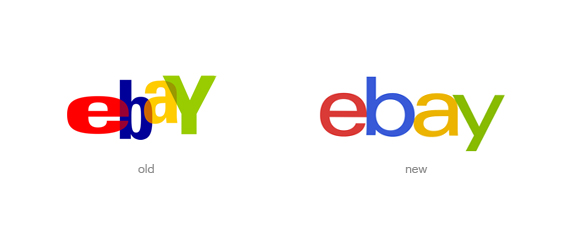
I’m happy about eBay’s announcement yesterday. After 17 years they will replace their logo. Following the trend of simplifying visual identities (I wrote about Microsoft and Nivea some days ago) they killed the chaotic arrangement of characters, the overlaps, and chose a new font. All characters sit on a line now, with just slightly different colours (same color palette).
“Our vibrant eBay colors and touching letters represent our connected and diverse eBay community”, Devin Wenig, eBay’s President, said.
I admit that I don’t know if they chose the best execution with this new logo (I read some opinions about how eBay is losing personality with this new logo), but I believe the direction is right and primarily I’m happy we won’t see the the previous one anymore.

