UPDATE: In January 2013 Beiersdorf announced the offical new global design.
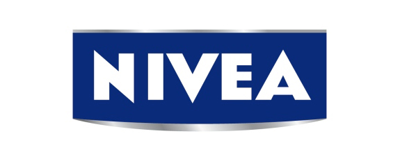
I was very happy when I saw NIVEA packages with a new logo in a drugstore in London last week, because I never really liked the old one with its gradients and chrome style (the one you see below). There isn’t any official statement or announcement for a big relaunch but maybe it is another step in the plan of the new Beiersdorf CEO Stefan Heidenreich who also criticized the huge advertising campaign with Rihanna: “Rihanna is a no go… I do not understand how to bring the core brand of Nivea in conjunction with Rihanna. Nivea is a company which stands for trust, family and reliability.”
I wish the new logo will be an international change. The return to the basic style inspired by the famous Nivea creme box would be such an improvement and, in Heidenreichs words: a strengthening of the core brand of Nivea.
Again: please feel free to correct my english in the comments. I’m not a native speaker so there might be any grammar or spelling mistakes in my posts :) I really would appreciate your help.

